Table of Contents
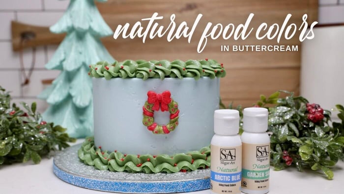
Introducing, The Sugar Art Natural Colors
Scroll all the way down to review our FAQ's (and very important information) on Natural Food Colors!
The time has come — we’re taking the leap into something new, exciting, and undeniably challenging: Natural Food Colors. After nearly a year of research and development, we’re thrilled to begin releasing our very first six Fall-inspired tones, with sixteen more on the way. Each one has been carefully crafted to meet the same high standards you’ve come to expect from The Sugar Art.
Before diving in, I want to say thank you. Holly and I have felt an incredible amount of support from our community online. Every message, comment, and bit of encouragement has meant the world to us. We know we’re not just creating a new line of colors — we’re doing our best to help an industry transition into a new era of baking. And as always, we’re here to teach, share, and grow alongside you.
Now, understand — natural colors are not easy. They’re sensitive to light, heat, and acidity. They’re living, organic pigments, which means they can be unpredictable and far less stable than synthetics. The color payoff is also five to seven times weaker, requiring heavier pigmentation to achieve rich tones - as you have seen in some of our videos this year.
And with global demand rising due to regulatory changes, sourcing these raw materials has become increasingly expensive and difficult as well, which unfortunately get passed down to the end-user.
So why do it? Well, because we need to. Naturals represent the future of our food industry — colors derived from botanicals, minerals, and plant-based sources rather than synthetic chemicals. They’re gentler on our bodies and better aligned with the direction the FDA is moving. So for me personally, this is more than a product launch — it’s a responsibility to innovate for bakers - as long as I am able.
Now, when looking into natural colors - you may have noticed many companies stop at offering straight raw pigments. But that’s not what we do at The Sugar Art. I’ve spent decades as a professional cake decorator and somewhat of a color scientist, so I knew we could do more.
On this journey, I focused on isolating and blending raw pigments that wouldn’t react with one another — creating a truly homogenized, easy-to-use liquid natural colors that perform beautifully across icing mediums.
This is what sets The Sugar Art apart: a deep understanding of color, science, and the sugar artist’s craft — all combined to make natural not just possible… but beautiful.
Our debut six shades were chosen because they’re versatile, timeless, and seasonally stunning. These tones transition effortlessly through the year, but shine especially bright in fall.
So let’s get started.
Ingredients Used 🌿
Before diving into each formula, it’s important to understand the foundation of our natural color pigments.
All of our natural food colors are made from pigments derived from botanicals — not the whole plant itself. These pigments are carefully refined through a complex extraction process that isolates the pure color compounds from the juices, sugars, and solids of plants, leaving behind a concentrated, natural food color additive.
It’s important to note that these are not dehydrated plants or powders commonly used in smoothies or supplements. Instead, we use FDA-approved food color compounds extracted from botanicals like beet and spirulina — ensuring high purity, strong performance, and consistency in all of our natural food colors.
How To Use Natural Colors 🎨
We have formulated and tested this first collection extensively in both buttercream and royal icing - our colors work for BOTH - ensuring they perform beautifully for cake decorators and cookie artists alike.
These natural colors are water-based, making them ideal for icings, glazes, and other non-chocolate applications. Because of that, they should not be used to color chocolate — but don’t worry, I’m already developing a new natural line made specifically for chocolate, so stay tuned!
You can experiment with coloring baked batters, such as cakes or macarons, but keep in mind that most of these pigments are not heat-stable. The color will fade or bake off during the heating process, which is why we don’t recommend them for baked applications at this time. Not until I do more research and glean understanding from fellow artists in the industry.
Now that you know how to use them — let’s talk about the colors themselves.
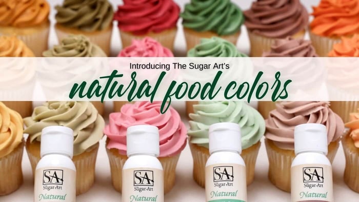
Meet the 6 New Natural Colors
Dahlia — My Personal Favorite
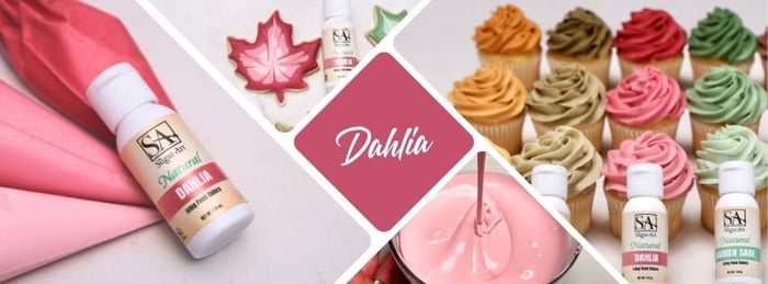
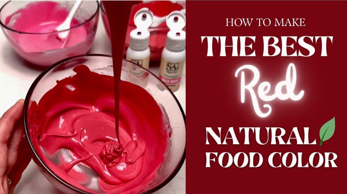
Let me introduce you to one of the most captivating colors in our new natural collection — Dahlia. This shade holds a special place in my heart because it perfectly embodies what makes natural food color so beautiful, complex, and alive.
When you first apply Dahlia, you’ll notice — it begins as a soft, bright hue when wet, then gradually deepens as it dries into a rich, velvety tone. This is true for both royal icing and buttercream.
This tone transformation is thanks to the unique marriage of two incredible ingredients: beet and paprika (Anthocyanin).
The beet provides the foundation — a bold, powerful red-purple pigment with natural depth and elegance. On its own, it’s stunning, but I wanted to elevate that vibrancy even further. By introducing paprika, with its warm orange-yellow undertones, the two pigments create a perfect harmony — resulting in a radiant, multidimensional shade that feels both timeless and modern.
Here’s where things get even more fascinating: beet color is highly pH-sensitive.
In acidic recipes, the tone will lean more of a vibrant red!
In alkaline environments (like recipes with baking soda), the same pigment can shift dramatically toward purple or even blue.
The paprika I included, balances that pH shift, brightening the hue, and ensuring that “Dahlia” always dries into the most beautiful, balanced shade possible.
Of course, with every natural pigment comes a tradeoff. While paprika enhances the color’s brightness, it’s also light-sensitive — it is one of the most delicate natural pigments when it comes to UV exposure. To keep your finished confections glowing as beautifully as when you first decorated them, store them away from direct light. While fading won’t happen overnight, consistent exposure can gradually soften the tone.
Garden Sage
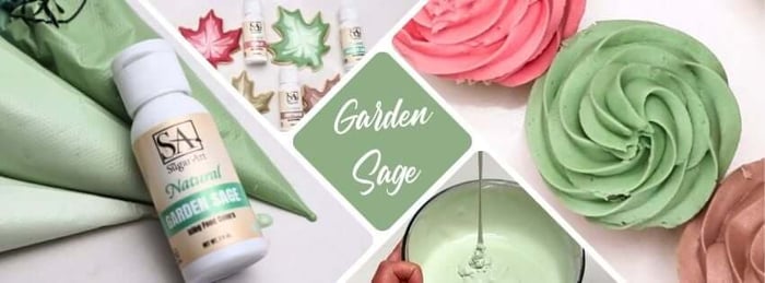
This shade is more than just “green.” It’s a living reflection of nature’s versatility, capturing the serenity of soft mint leaves and the depth of forest pine, all within one incredible color.
Garden Sage is born from the combination of two powerhouse pigments: Spirulina and Beta Carotene. Spirulina, a blue pigment derived from algae, brings a brilliance to this blend — so vivid that it closely mimics the strength and saturation of synthetic Blue 1, yet remains entirely natural.
When the Spirulina extract is paired with the sunny yellow of Beta Carotene, the result is a balanced green — soft, rich, and full of life.
In lighter tones, it feels crisp and refreshing, like mint.
Deepened slightly, it becomes a lush leaf green that feels grounded and organic.
And at its darkest, it transforms into a deep pine tone, reminiscent of evergreen forests in the fall.
Though Beta Carotene is one of the more stable natural yellow pigments, it still has a delicate side — it’s sensitive to prolonged light exposure. Over time, as ambient light interacts with it, Garden Sage can gently shift toward the blue spectrum. To keep its tone balanced and true, we recommend keeping finished creations covered or out of direct light when displayed.
Ivory — But Also, Gold ✨
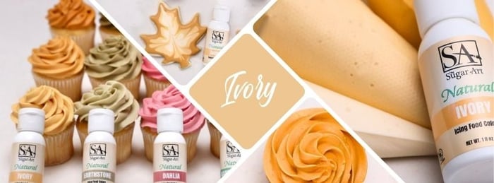
The name truly says it all. Ivory is that elusive tone every baker dreams of — the perfect off-white when used delicately, and a rich, golden warmth when built to deeper saturation.
What makes Ivory so special is its three-pigment harmony — a blend of Beta Carotene, Purple Sweet Potato, and Spirulina. Together, these natural hues form a balanced trio that captures both softness and strength.
Beta Carotene lays the foundation with its radiant yellow tone — it’s the powerhouse that gives Ivory its golden base.
Purple Sweet Potato steps in with a gentle touch of red, adding warmth and subtle complexity, allowing the color to shift gracefully toward that soft golden glow.
Spirulina finishes the formula with quiet depth, rounding out the hue and bringing balance to its brightness.
Each pigment plays a critical role, but the science behind this blend is where the magic happens. Purple Sweet Potato’s naturally higher pH contributes to greater stability, helping the final color stay rich and consistent over time. Meanwhile, Spirulina’s cool tone tempers the warmth, giving the color its signature creamy depth.
Because Beta Carotene is a light-sensitive pigment, Ivory should be kept away from prolonged light exposure once your design is complete. Over time, excess light can cause it to shift toward more neutral, earthy tones — still beautiful, but softer than its original golden glow.
Ivory (and its deeper alter ego, Gold) is a testament to what happens when nature’s most vibrant pigments work in perfect harmony — understated, luminous, and effortlessly elegant.
Earthstone 🌾

If you’ve ever loved our Gel Color “Stone,” then get ready — we’ve created the natural dupe.
This shade captures the raw beauty of nature itself — think weathered wood, soft moss, and the grounded tones of autumn forests.
Earthstone is crafted from a thoughtful blend of Paprika and Spirulina, two pigments that couldn’t be more different. Paprika brings that soft, warm undertone, while Spirulina contributes a deep, natural blue that grounds the tone and gives it its signature woodsy depth.
The result? A complex hue that feels equal parts vintage and modern, making it the ideal complimentary color for fall. Whether you’re pairing it with rich burgundies, creamy neutrals, or metallic accents, Earthstone is amazing addition to those palettes.
There is, however, one important note for those who love to perfect their sugar art: both Paprika and Spirulina are sensitive to prolonged light exposure. Over time, Earthstone may slowly shift toward a bluer undertone, especially if left in bright or direct light. This happens as the Paprika pigment begins to oxidize and lose intensity — a natural characteristic of this beautiful ingredient.
To preserve Earthstone’s signature rustic charm, keep your finished designs covered or stored away from bright light whenever possible.
Harvest 🍂
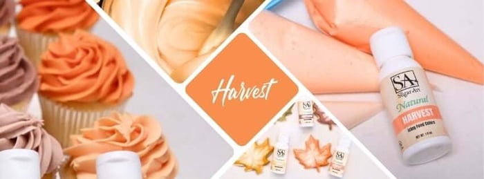
Another amazing feat of our natural food colors: Harvest. A simple “orange” doesn’t begin to describe this color. Harvest is warmth, nostalgia, and autumn light captured in a bottle — a soft, glowing orange that feels alive, comforting, and beautifully natural.
This radiant hue is crafted from a delicate balance of Paprika and Purple Sweet Potato — two pigments that, when handled with precision, create a tone that’s nearly impossible to achieve when mixing natural colors on your own. This is where years of color science and confectionery experience come together.
Creating a stable orange in naturals is one of the greatest challenges in color formulation. Paprika offers that unmistakable warm glow, but it’s fragile — highly sensitive to both light and pH. Purple Sweet Potato, on the other hand, provides a subtle red-violet base that gently grounds the brightness of Paprika, allowing the two to harmonize into a soft, sunlit orange that feels effortless yet refined.
To give Harvest more stability, we carefully adjusted its pH — striking just the right balance to help the color hold its tone longer in your finished desserts. Still, as with all pigments containing Paprika, light remains its biggest enemy. Over time, if left exposed, Harvest will begin to fade softly toward a peachy hue — a lovely transformation, but one best avoided by keeping your work stored or displayed out of direct light.
Harvest is the very definition of fall in color form — a glowing tribute to nature’s palette, created for bakers who crave both beauty and authenticity in their art.
Driftwood
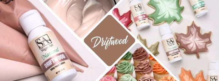
As we drift toward the end of this first collection of natural food colors, let’s talk about one of the most elusive colors to perfect — brown.Believe it or not, achieving a beautiful, balanced brown is nearly as difficult as producing a flawless red. That’s true in both synthetic and natural color worlds.
You’d think brown — the very essence of earth tones — would be the easiest to create naturally. But the truth is, it takes a deep understanding of color science to capture that soft, neutral warmth without it leaning too dull, gray, or bitter. After much experimentation, we finally found that balance, and I’m thrilled to introduce you to Driftwood.
Driftwood is crafted from a trio of naturals: Paprika, Spirulina, and Beet. Together, they form a warm, grounded tone that transitions beautifully from soft earthy beige in lighter applications to a deep mocha brown when intensified.
Paprika serves as the base, giving the color its natural warmth and richness.
Spirulina adds subtle depth, toning down the orange hues and grounding the palette.
Beet brings the final touch — a whisper of red that gives Driftwood its signature cozy undertone.
In true baker fashion, it’s a pinch of this, a dash of that — but the result is pure art.
Like all colors that rely on Paprika, Driftwood does have one delicate trait: over time, light exposure will cause the Paprika to fade, leaving the cooler pigments — Spirulina and Beet — to take center stage. This shift can create a gentle purplish tone if left in bright light for extended periods. To preserve its warm, balanced beauty, keep your finished confections out of direct light whenever possible.
When we first set out to create a natural brown, we tested what was already available — and found that the only pure natural “brown” pigment on the market came from caramelized sugar. While that might sound ideal, it comes with a serious drawback: it tastes bitter. And as both a baker and a color scientist, I couldn’t let flavor take a back seat to color.
So we created Driftwood — a custom blend that delivers all the warmth, richness, and reliability of a true brown, without ever compromising taste or texture. It's my second favorite natural food color I've made, to be honest.
It’s nature’s version of neutral — sophisticated, earthy, and effortlessly timeless.
A Few Key Notes Before You Dive Into Natural Food Colors
Before you bring these natural food colors into your kitchen, it’s important to understand that natural pigments behave very differently from synthetics. They’re derived from living, organic sources — plants, roots, minerals — which means they’re beautifully unique, but also far more delicate. Here are a few essential points every sugar artist should know:
🍃 Light Sensitivity
Many natural pigments are highly sensitive to light exposure. Prolonged contact with direct or bright light can cause gradual fading or tonal shifts. Store finished confections away from sunlight or strong ambient lighting.
🔥 Heat Sensitivity
Most natural food colors are also sensitive to heat. Excessive heat during baking or prolonged exposure to warm environments will alter their tone or intensity.
🍋 pH Sensitivity
Some natural food colors react to the acidity or alkalinity of your recipe. High-pH (alkaline) environments — like batters with baking soda — can cause certain colors (especially reds and purples) to shift toward cooler tones like blue or purple. As I mentioned before, high-acidic ingredients will help reds turn brighter. Balancing your recipe’s pH can help maintain the intended hue.
❄️ Proper Storage
Once opened, store your natural food colors in the refrigerator to extend their lifespan and maintain stability. Keep the lids tightly sealed to prevent oxidation and contamination.
🎨 Protect Finished Designs
After decorating with your natural food colors, always cover your finished confections to preserve their color. Natural food colors will remain beautiful much longer when shielded from air, light, and temperature fluctuations.
These simple steps will help ensure your creations stay as vibrant and true as the day you made them — letting nature’s colors shine their brightest in your sugar art.
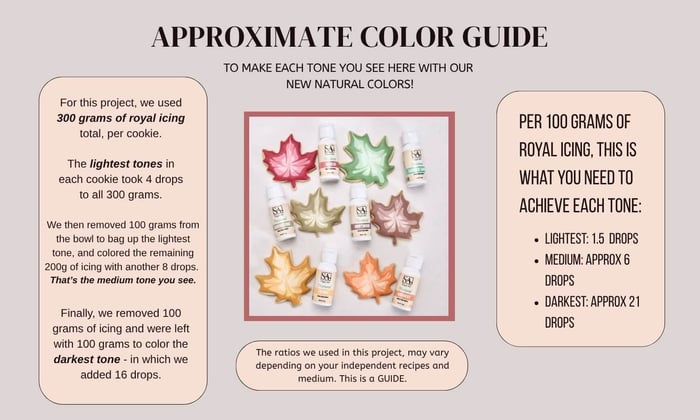
A quick guide to our coloring process with Royal Icing and our Natural Food Colors:
FAQs
What is the shelf life of naturals?
For this initial release, we have tested our natural color's stability up to 6 months from the date of manufacturing. This could change in the future, as we have more time to verify.
How to properly store naturals?
Once opening and using your natural colors, we strongly recommend refrigerating them and ensuring the cap is firmly closed. However, we store our natural colors in a temperature controlled building at 72 degrees and have had no issues.
Are these good for baking?
The short answer - no. Even though many natural pigments claim to be more heat stable than others, in my personal testing we have had limited success. However, feel free to do your own tests around this in small batches - especially macarons.
** Where I had the most success during baking using a very low temperature (no more than 250 degrees) and baking for a longer duration.
Will you be offering smaller or larger bottles?
At this time, no. Our one ounce bottles are the best blend of size and cost efficiency for the sugar art industry.
Are these good for buttercream AND royal icing?
Absolutely, you have seen us demonstrate the same exact naturals in both mediums.
Are these ok to color chocolate?
No - not at all. These are water-based pigments, and you need to strictly use them for water-soluble mediums (ie. icings, fondant will work too, etc).
Will you be offering more colors?
YES! I am very excited to continue releasing more and more colors in the coming months. As technology and regulations evolve, I will strive to offer even more options than the 20 colors I have formulated.
After this release - expect 14 more.
Do these have a taste?
Yes - they can. However, we have custom curated the most mild tasting naturals on the market! We have experienced little to no taste, even at our medium tones.
The less pigment you use, the less risk for an aftertaste. The same is true when you over-pigment your icings - the more you use, the more you may experience an aftertaste.